CSS - 图像精灵 (Image Sprites)
CSS Image Sprite 将多个图像合并到一个单一的图像文件(精灵图像)中,并使用精灵图像内的坐标来显示这些图像。这有助于减少服务器请求数量并提升网站性能。
图像精灵通常用于网站上的图标、按钮和其他较小的图形。然后使用 CSS 根据需要显示精灵图像的特定部分。
如何在 CSS 中实现图像精灵?
我们将按照以下步骤在 CSS 中实现图像精灵。
- 创建精灵图像: 首先,使用 Adobe Photoshop 等图像编辑工具创建一个包含所有要用作精灵的单个图像的图像。
- 确定图像位置: 精确记录主精灵图像中所有子图像左上角的坐标。这可以在 CSS 中用于渲染图像的该部分。
- 显示图像: 我们使用 CSS 的 background-image 属性在网页上显示精灵图像。
- 调整位置: 我们使用 background-position 指定精灵图像中内层图像的左上角位置。然后使用 CSS 的 height 和 width 属性指定从左上角开始应该渲染的尺寸。
.sprite-icon {
    width: 75px; /* 设置显示图像的宽度 */
    height: 75px; /* 设置显示图像的高度 */
    background-image: url('sprites.png'); /* 精灵图像的路径 */
    background-position: -40px -40px;
        /* 精灵中单个图像的位置 */
}
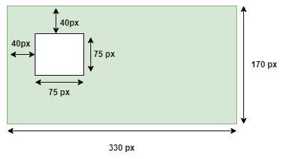
在上面的示例中,首先我们指定了子图像的高度和宽度为 75px。然后指定了包含所有内层图像的精灵图像的 URL。然后使用 background-position 属性指定内层图像左上角的位置为 (-40px, -40px)。下面的图示显示了基于以上值如何选择内层图像。
CSS 图像精灵基础示例
以下示例演示了如何使用 CSS 图像精灵从单个图像文件中显示多个图像。
示例
<!DOCTYPE html>
<html>

<head>
    <style>
        img{
            height: 60px;
            width: auto;
            border: 3px solid;
        }
        .main{
            display: flex;
            justify-content: space-around;
        }
        .bootstrap, .html, .css {
            width: 150px;
            height: 150px;
            background-image: url('/css/images/devices.png');
            background-repeat: no-repeat;
            border: 5px solid;
        }
        .bootstrap {
            background-position: -5px -5px;
        }
        .html {
            background-position: -155px -5px;
        }
        .css {
            background-position: -277px -5px;
        }
    </style>
</head>

<body>
    <h3>Original Image</h3>
    <img src="/css/images/devices.png"/>

    <h3>Image sprites</h3>
    <div class="main">
        <div class="bootstrap"> </div>
        <div class="html"> </div>
        <div class="css"> </div>
    </div>
</body>

</html>
CSS 图像精灵悬停效果
以下示例演示了在图像精灵上使用 hover effects 的效果,当鼠标悬停在图像上时,图像会略微变透明。
示例
<!DOCTYPE html>
<html>

<head>
    <style>
        img{
            height: 60px;
            width: auto;
            border: 3px solid;
        }
        .main{
            display: flex;
            justify-content: space-around;
        }
        .bootstrap, .html, .css {
            width: 150px;
            height: 150px;
            background-image: url('/css/images/devices.png');
            background-repeat: no-repeat;
            border: 5px solid;
        }
        .bootstrap {
            background-position: -5px -5px;
        }
        .html {
            background-position: -155px -5px;
        }
        .css {
            background-position: -277px -5px;
        }
        .bootstrap:hover, .html:hover, .css:hover {
            opacity: 0.7;
         }
    </style>
</head>

<body>
    <h3>Original Image</h3>
    <img src="/css/images/devices.png"/>

    <h3>Image sprites</h3>
    <div class="main">
        <div class="bootstrap"> </div>
        <div class="html"> </div>
        <div class="css"> </div>
    </div>
</body>

</html>